Brand Guide
Brand Messaging
About MSEA
Our members are teachers, education support professionals, administrators, certificated specialists, higher education faculty, and student and retired members whose mission is to create great public schools for every child in Maryland. MSEA works to empower members to make a positive difference in their professional lives in order to elevate the quality of public education for all students.
We’re all about getting Maryland’s educators and public schools the tools and support they need to help every student succeed, whether it’s through lobbying in Annapolis for school funding and a secure retirement, bargaining decent salaries, fair and transparent evaluations, and better working conditions at the local negotiating table, providing legal aid and expert assistance whenever needed, or ensuring access to meaningful professional development and training.
Brand Position
The Maryland State Education Association — the largest union in Maryland and an affiliate of the largest professional union in the country — advocates with and for 75,000 employees of the state’s public schools to elevate the quality of Maryland public education and enhance the education profession in the state.
Tone & Voice
We are...
Passionate, not unreasonable.
Professional, not exclusive.
Assertive, not strident.
Optimistic, not unrealistic.
Urgent, not knee-jerk.
Logo
Primary Logo
The primary logo functions as a visual rallying cry for MSEA’s multiple stakeholders.
A refined, type-based mark that balances classic qualities with modernity and forward thinking. Graphic elements underscore education and represent multiple constituencies coming together to advocate for and shape the future of education in the state.
Color
Acceptable Colors
The MSEA logo can only appear in the following solid, 100% opaque colors:
- Full Color
- White
- 100% Black
Used in white, it can appear over any color background (or an image) as long as it’s easily readable.
Clear Space & Minimum Size
Clear Space
Maintain a clear space of 2X on all 4 sides of the logo, where X is the height of the letters in “EDUCATION.”
Minimum Size
The minimum height for the primary logo in print media is 0.5". Certain small promotional items, such as pens, may be an exception.
For even smaller use cases, see page 16 for the alternate small-use logo guidelines.
Best Practices
Aim For
Aim for approved brand colors and plenty of clear space around the logo.
Avoid
Avoid altering the logo in any way by changing or adding elements, or only using portions of it.
Alternate Logo for Small Use
In some instances, such as on promotional items, a smaller and more simplified logo may work better.
The alternate small-use logo can be used in these situations instead of the primary MSEA logo. All of the requirements and guidelines for the primary logo also apply to the small-use logo.
Color
Color Palette
The MSEA color palette represents our values with bright colors balanced by a complementary selection of secondary colors.
Primary Colors
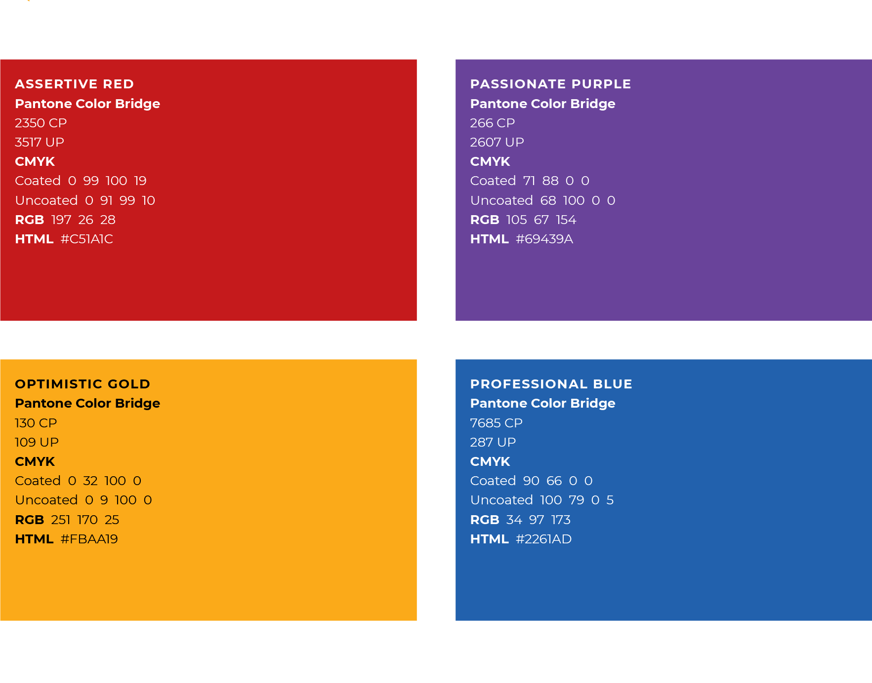
Secondary Colors
Modern Teal, Grounded Gray, and Soft Gray should be used as accent colors to balance out the strength of the MSEA primary colors. The gray tones in particular work well as fields of color, while Modern Teal creates accent and contrast when used with any of the primary colors. Using plenty of white space helps balance the intensity of the other brand colors. Black should only be used minimally, such as for text or thin rules. Any of the secondary colors can also be used as tints.
Web Accessibility
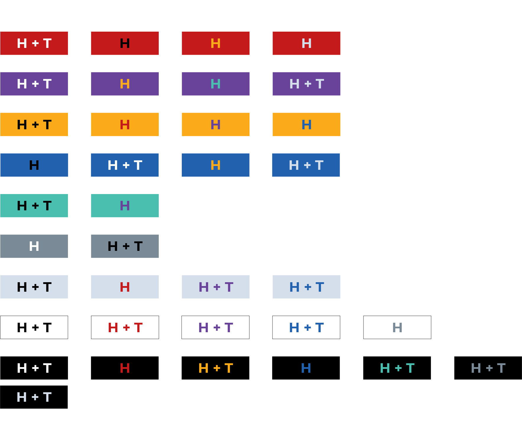
Everything that appears online — websites, display ads, social images, etc. — should conform to WCAG accessibility standards, including relative color contrast.
Screen readers sometimes can't read text that doesn't follow accessibility guidelines, which makes the page impossible for the visually impaired to read. Also, visual impairment alone (including color blindness) can make certain color combinations very difficult to read. For these reasons, always check relative color contrast for online materials using the chart below. All of the color combinations are at least AA accessible at the sizes inticated.
H
The colors are at least AA accessible at headline size, which is defined as 14 point (typically 18.66px) and bold or larger, or 18 point (typically 24px) or larger.
T
The colors are at least AA accessible at text size, which is any point or pixel size.
Typography
Preferred Typefaces
Montserrat
Montserrat is a geometric sans serif typeface, based on urban typography found in signs and posters, which visually supports MSEA's brand. Use Montserrat for headlines, subheadlines, labels, and any other typographic application that requires impact and readability.
IBM Plex Serif
IBM Plex Serif is a neutral, friendly Grotesque-style typeface and has excellent legibility in print, web and mobile interfaces. With its expressive nature and easy readability, IBM Plex Serif works well for body copy and captions, in both normal and italic styles.
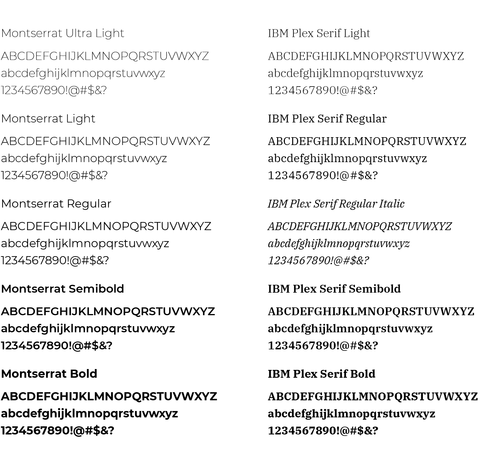
The above selections are just a sample of each typeface. Any weight or style may be used in a harmonious manner to complement and support communications. Both fonts are available for free from Google.
Working with Google Fonts & Alternates
Downloading Google Fonts
- Go to fonts.google.com.
- Find and click on the font you want to download.
- On the next page, in the upper right corner, click on “Download family.”
How to Install Google Fonts in Windows 10
- Download the font file to your computer.
- Unzip that file anywhere you like.
- Locate the file, right click and select Install.
Alternate Typeface
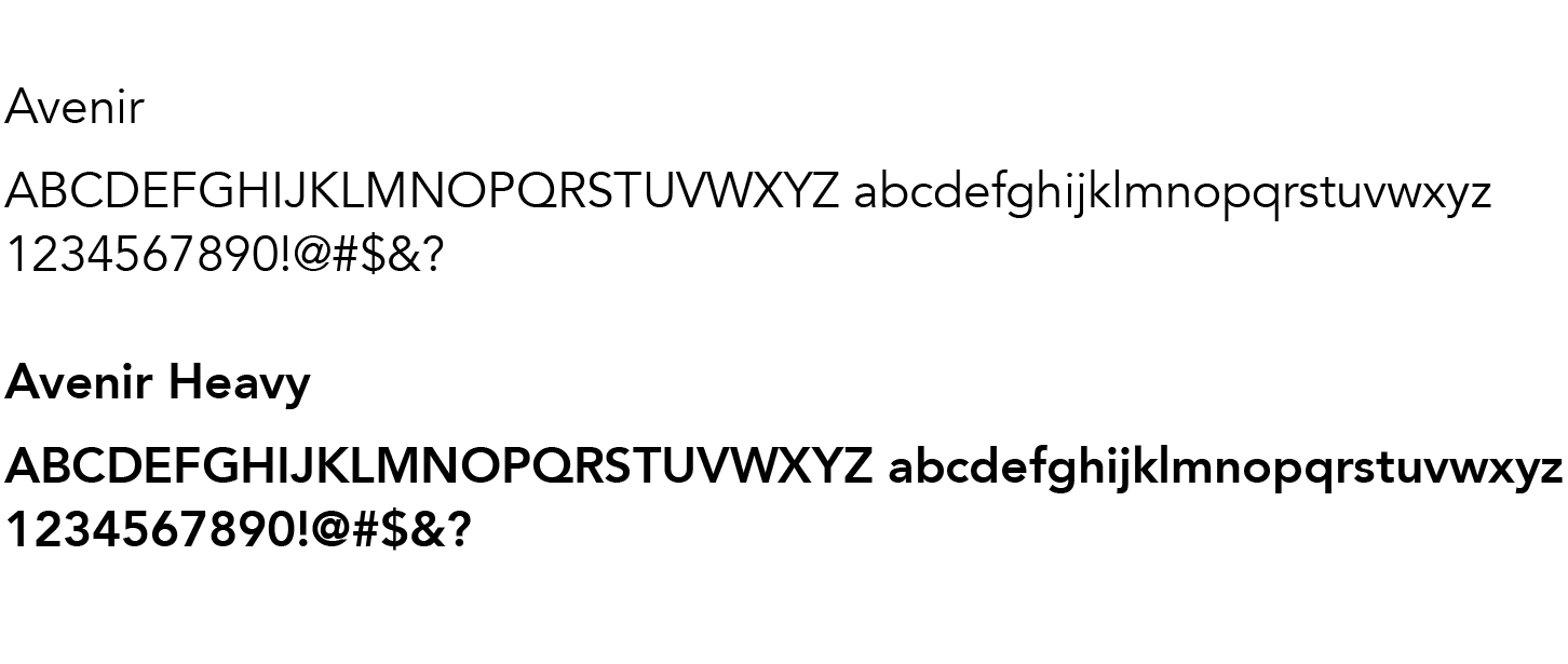
In certain situations, it may not be possible to use Montserrat or IBM Plex Serif. In these instances, use the Avenir font family.